Friday, November 21, 2008

Web 2.0!!! (Week 10)

http://www.robmillard.com/web20map.png

Well, we all know what the Internet is but what is Web 2.0? What's so special about it? Here are five characteristics that define Web 2.0

1) Dynamic content & viewable on multiple platforms

2) User contribution

3) Social Media

4) Online Applications

5) Harnessing Collective Intelligence

1) Dynamic content & viewable on multiple platforms

Over the course of the last few weeks we have been learning about the characteristics of Web 2.0 which was coined by Tim O’Reilly of O’Reilly Media Inc.
No more shall the internet just be what it is. It's always changing. Dynamic content is information that is always changing. For example, you can now get interactive pages that let you personalize your own space the way you want it to be shown to you. For example, this very blog I am currently using can be displayed the way I want it to be displayed.
An example of a dynamic characteristic is a Playstation 3 console. Dynamic content is a characteristic that refers to content that is viewable on multiple platforms. A Playstation 3 is an example of dynamic because the content and design live separately. The content lives in a database that is placed on a webpage only when needed or asked. The benefit of this is that it allows for quicker page loading and it allows just about anyone, with limited or no web design experience, to update their own website via an administrative back-end. The Playstation 3 sole purpose is to play video games however, does so much more as you can download content, play videos, surf the internet etc.
http://gamer.blorge.com/wp-content/uploads/2007/09/playstation3swindle4.jpg

2) User contribution

The second characteristic is user-generated content. User-generated simply refers to content that individuals help produce and create. Present day, the internet is no longer strictly used for professionals. It's used by anyone who knows how to use a computer and has internet. The interchangeability of information allows content from almost anything and anyone to be put on the internet. A great example of a user generated website is the "Internet Movie Database." Commonly referred to as IMDB.com, the site allows people to chat and discuss in regards to their favourite celebrity’s. This site allows people to create new topics and discuss anything relating to their favourite celebs. People are also given the advantage of posting images and videos of their favourite celebrities. IMDB allows viewers to vote on celebrities with regards to their popularity. This is considered user-generated value, while discussing celebs is considered user-generated content.

http://www.robertroose.com/img/posts/imdb-dvd-iron-man-01.jpg

3) Social Media

The third characteristic is social media. Social media refers to online media that provides opportunities for socializing, connecting and sharing. Over the years socializing has expanded allowing people to share content such as photos and information with others. There are many examples of socializing networks which include Facebook, MySpace, and LinkedIn. Another example includes Flixster. Flixster is a social movie site allowing users to share movie ratings, discover new movies and meet others with similar movie taste. In addition to the site Flixster has applications available on Facebook, MySpace as well as on the iPhone.

http://mike.blogs.com/photos/uncategorized/flixster.jpg

4) Online Applications

The fourth characteristic to Web 2.0 is online applications. Traditionally applications were thought of something that we would buy and install on the computer. However, there is a new trend towards software that runs software online. Instead of purchasing software, the applications open from your browser without actually installing or downloading anything. How cool is that? There are many examples of online applications that one can use for free. My personal favourite is MapQuest. MapQuest is a map publisher and a free online Web mapping service. MapQuest allows you to find a route in a matter of minutes, quickly and efficiently. MapQuest lets users automatically find their location, access maps and directions and locate nearby points of interest including airports, hotels, restaurants, banks and ATMs all at the click of a button.

http://ancestortracks.com/Westmoreland,%201857/Daniel_Koch_tract,aerealMapquest-view.jpg

5) Harnessing Collective Intelligence

The fifth characteristic is Harnessing Collective Intelligence. This characteristic uses tagging which essentially means assigning keywords to content such as videos, photos, songs, etc. Why tagging you ask? Well tagging makes it easier to organize and describe information in a manner that is personally meaningful. Tags also enhance productivity and save us time. Along with this, it is now easier for anyone to create content which would usually be left for professionals. This is called "crowdsourcing." In the early stages of internet, websites were created using HTML programming. However, now days there are web builders that allow you to create your own website. An example would be Tripod. Tripod is web hosting service that formed part of the first wave of user-generated content. Tripod offers a variety of free web hosting services offering a blogging tool, a photo album manager, and WYSIWYG page editing. Websites like Tripod allow easy access to creating your own website without using HTML programming which to many is difficult.

Wednesday, November 5, 2008

Table Pong (Week 9)

Flash Assignment

Artist Statement
My concept was to create an interactive ping pong game involving in some capacity tennis. Tennis has been one of my hobbies for the past ten years; as a result I have created an interactive game. My goal is to attract a large audience into playing my interactive flash video game. The flash game is called Table Pong, incorporating Ping Pong, Table Tennis and Tennis. I wanted to create a game that stands out, captures the audience’s attention and persuades them to play. The rules of the game are simple, score ten points before your opponent does and be crowned Table Pong Champion.
The target market for my interactive flash video game is children between five to twelve years of age. It was quite easy deciding what age group to target however, the approach and the way I would format buttons and images was at first difficult. Before I started with the project I planed everything and did a rough sketch on paper so that I had an idea of what I was going to do. The interactive flash game “Table Pong” is geared towards young children who enjoy the high replay value of this game.
Based on my limited experience with Adobe Flash, I decided to find some tutorials on the web in order to help me further establish my plan on creating a cool and interesting ping pong/table tennis game. The first aspect that needed to be considered was the layout. I had many ideas however did not know how to transpire them. I had a general idea to create a ping pong game, however with the love of tennis I decided to incorporate ping pong, table tennis and tennis. I decided to create a bird’s eye view of a tennis court that I would use as my background. The tennis court was created on Abode Photoshop and exported to Flash. Next I started creating my main menu which incorporated a basic title, three basic buttons and my symbol which is two table tennis paddles in a form of an X with a ping pong ball in between. I took a photo of a paddle and flipped them over to create the X with a ping ball in the middle. I decided to use the Stencil Std type font as it gives the game a more children-like feel and with the black background, an appropriate appearance. For the instructions, I used the Impact font to give it a clean and professional look.
There were many challenges and obstacles that were encountered while creating my interactive flash videogame. One major challenge was the action script function. With my brief knowledge of flash I decided that additional research was necessary in order to create a captivating and interesting game. I did some research on the internet and with the help of some online tutorials I was able to further my knowledge on the action scripts. The action scripts are the most important part of my interactive flash videogame and as a result the bulk of my research focused on it.
The finished product was one that I was very pleased with. I spent a lot of time on the interactive flash game and it was very rewarding to find out what someone can learn by experimenting with different features. I learned a lot about the various types of fonts, symbols and action scripts. During this assignment I also learned how to convert pictures and use them as either a motion clip, button or graphic. My piece surpassed my envisioned goal, and looks like a videogame that children would actually enjoy playing. Although there are a few minor bugs in the game, the game is still playable and enjoyable. I am very pleased and excited about my accomplishments.

In Class Critique
My animation was viewed in my lab class which allowed for constructive criticism. However, my fellow peers and Professor really enjoyed my flash interactive game. I was privileged to watch the work of my peers. I was truly amazed of how exceptional all students work was. They applied all skills used in our tutorial but to a higher level. It was amazing how everyone had a different idea to work with. It simply shows the range of creativity in our class and it truly was impressive.

Tuesday, November 4, 2008

Covers that Have Meaning (Week 8)


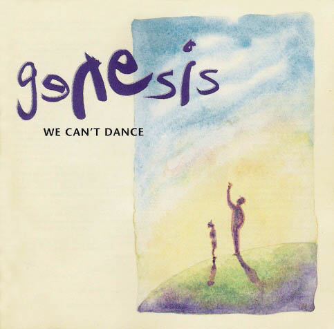
My album cover of choice that reminds of me of a contemporary album is none other than “Genesis- We Can’t Dance.” This cover has a simple look yet an important meaning. The cover shows a drawing that can clearly be seen as father and son together looking at the sky. In the background the sun shines on them. The drawing represents a perfect day as everything in the drawing seems perfect. I remember when my parents purchased the Genesis CD when I was in grade three. I remember looking at the childlike cover and loving it. The cover had something the both children and parents could look at. The father-son in my opinion has an important meaning and the way it’s drawn on a mountain like hill makes it that more special. I believe the meaning of the father and son is to show closeness that the two have for one another.
An album cover that I found on the website
www.alexsteinweiss.com was one that appealed to the eye, incorporating two objects. The cover incorporates a theatre screen board and a record disk in the background. This picture is very intriguing as it has nice clean and smooth look to it. I like the combination of the two old school elements. I also really like the red lines on the record disk. The redness gives it a more vibrate and sharp look.

The Genesis cover along with the cover found on alexsteinweiss.com reminds me of contemporary covers.

Thursday, October 30, 2008

The Idea Counts (Week 7)

This week was an interesting week especially in our digital media lecture and lab. In our digital media class we were introduced to a SFX assignment which looks very exciting and promising. Using other means to produce sound is very difficult, yet interesting. I loved the example where they used fruits and vegetables to reproduce a video game. The sounds sounded so real it was kind of scary. All the sounds were reproduced using secondary means such as fruits and vegetables. This assignment is very exciting but will be very difficult to reproduce an image using other means of sound.
In our digital media lab we got our hands on the flash program, learning the fundamentals. This week we learned how to make a motion guide which allowed us to make a bee move around the page. This might sound like nothing but the reward was thrilling for me. We got to create a path in which allowed the bee to move anywhere around the page. The most exciting thing this week was putting sound. The sound made the flash video complete. Without sound it did not feel complete. I learned more about flash however, only two weeks using the program there is a lot more to learn. One thing I’m looking forward to is using the slideshow tool. As mentioned in the previous week I want to create a possible slideshow interaction. I believe the interaction tool will allow me to create a basic yet exciting flash video.

The Adventures of Flash!!! (Week 6)

This week in digital media class we were introduced to a new program and new assignment. The new program is called Abode Flash. There were many ideas expressed in our digital media lecture. The flash program is a program that is complex however, with a little practice and patience, looks like a fun program. In the digital media lecture I loved the example “Do You Want to Play a Game” and “Ross Macaulay.” These two examples captivated as I was in shock on how great they were. I am naturally a person who has high standards but these examples will be very hard to reach.
One of my more interesting ideas is to create a Halloween flash video. My inspiration is to create a scary and daunting video in which a series of scary questions would be asked with animations and photos in the back. This is a tough task however; with some patience and practice anything is possible.
Another one of my examples is to create a motorcycle slide show. My brother has a Honda CBR 600CC and I always wanted to do a slide show of his bike. I believe this would look awesome on flash and would really captivate people through both the actual bike and the loudness.
This project will require some research and thinking on the layout. The project will also require myself to get familiar with the program quickly as I only have three weeks to complete this project.
There are many techniques that must be used however, my experience is minimal and I must use my labs to further my knowledge as I am relatively new to flash. Almost all the videos are produced using flash however, my experience is minimal and I must further my knowledge in order to get a better look at what I want to produce.


http://www.skipnoproductions.com/test/Site/Images/flash_logo.gif

Saturday, October 11, 2008

My Tennis Poster (Week 5)

Artist Statement
My concept was to create a poster promoting tennis. Tennis has been one of my hobbies for the past ten years; as a result I have created a poster to promote a tennis academy in my hometown of Woodbridge, Ontario. My goal is to attract a large audience into joining my academy. I wanted to create a poster that stands out, captures the audience’s attention and persuades them to further their knowledge about my academy. I was able to accomplish this by using the Impact font.
The target market for my tennis academy is males and females between eighteen to thirty-five years of age. It was difficult deciding what age group to target however that was immediately resolved when I chose the impact font. The impact font portrays seriousness and a level of professionalism within my academy. It also implies that one must be physically and mentally strong. The seriousness is also expressed in the catch phrase “Are You Ready”. The tennis academy is geared towards males and females looking to improve their on court performance, getting a good workout and having fun.
Based on my limited experience with fireworks, I decided to also use Photoshop. There were many skills used during the process of creating my poster. The first aspect that needed to be considered was the layout. I had many ideas however did not know how to transpire them. I had a picture from the Rexell Center, located in Toronto, Ontario, which I had taken when I went to go see a tennis event last summer. I decided to use that as my background; however I placed a filter called “Diffuse Glow” so that it had a professional look. Using fireworks I used the “Lasso” tool to cut out a picture of myself playing tennis. Next I decided what font and size I needed in order to attract my target audience. After looking for several types of fonts, I decided the impact font had the professional and bold look I was looking for. Using Fireworks and Photoshop I made the font larger, changed the white colour using effects so that it looked like a silver colour and decided to put a stroke around the font to give it a sharp vibe. The filters for the font included a drop and inner shadow, outer glow and gradient overlay. This gave the titles a professional look and made it clear my target market was for male and female adults.
There were many challenges and obstacles that were encountered while creating my poster. One challenge was finding out what picture to use. I had a great assortment of pictures however; the quality and resolution of them were not all professional in quality. As a result I had to take several photos at my local tennis court and decide which ones to choose. The second obstacle was eliminating the background in my picture, using the lasso tool. I brought the picture to Photoshop and used a filter called “Poster Edges” to give it an authentic and professional touch. Finally, choosing the right text was the last obstacle that I had to deal with. I decided to choose impact font. From there I had to decide which colour system to use. I decided that the spilt-complementary layout looked the most professional and appealing. Spilt-complementary colours consist of red, blue and gray.
The final outcome was a finished product that I was very proud of. I spent a lot of time on this poster but it was very rewarding to find out what someone can learn by experimenting with different features. I learned about various different types of fonts, different filters and the effects they had. My piece surpassed my envisioned goal, and looks like a real poster.
In Class Critique
The in-class critique session helped me realize some of the small errors I made in the process of creating my poster. One of the errors that Professor Henry quickly recognized was in regards to proximity. Proximity refers to a group of related items jointed together. Henry realized that the titles on the top and bottom were too close to the end of the page. Another small mistake was the gaps between the fonts. In some instances the gaps between fonts were larger than others. To conclude the major lesson learnt in the in-class critique session was the proximity mistake.

Media and Typography!!! (Week 4)


We live in a society surrounded by media. Everywhere we go, we see posters, billboards, magazines etc. These forms of advertisements and media are targeting a specific market through fonts, images, and design.

One example of this is the movie “Fantastic Four.” Fantastic Four is based on the 1961 comedy which was published by Marvel Comics. The Fantastic Four is formed during an outer space test flight in an experimental rocket ship. The four protagonists are bombarded by a storm of cosmic rays. Upon crash landing back on Earth, the four astronauts find themselves transformed with uncharacterized abilities. They decide to use their powers in a positive way and act as superheroes.
One typographic choice made in the design of the cover was to make the font characters bold, so that they stand out. This typography is bold and has a clean cut. It is very effective and powerful. The font is also blocky and represents the characters
bizarre power and strength. It appeals to a general audience however, by putting actor star Jessica Alba on the front cover; it is attempting to reach to all adults and children. The type font is effective in attracting a broad target audience as it portrays a professional and bold look.
http://www.comicbookmovie.com/images/news/fantastic-four/ff092005.jpg

A magazine that does not use typography well in order to send across its image is the magazine “Muscle and Fitness.” The cover compares the character Michael Chiklis, to his Fantastic Four character Ben Grimm. This cover uses a plain typographic at the top of the magazine. I believe the font type is Aerial however, I am not certain. The title of the magazine, which is the most important, uses yet a different font. The typography is behind the two characters which ultimately takes away from the font and its impact. The font type is appealing however, cannot be seen clearly. I believe that the font is not effective as it cannot be read by many.
The typography is effective to a particular audience as the font type is bold and large representing how to gain muscle in the shortest amount of time. I believe it is affective in attracting teens and adults who want to gain muscle. The font represents a clean and smooth look; however the page is clustered with too much writing. The characters also cover the main font which in my opinion takes away from what could have been a great looking magazine cover.

A cover that does a great job with little typography is the movie “Gone in 60 Seconds.” The movie is about a character who was a former master car thief forced to return to his former trade and steal fifty cars in order to avoid his brother being killed. The cover uses a simple but effective typography at capturing their target market. The cover uses a simple font type however it’s a font that is interpreted not read. The first time I interpreted the font, I knew it dealt with cars. The font is very effective as it is targeted to teens and adults who are car enthusiasts. The typography’s central message portrays a theme of fast and exotic cars.